menu menu
Eliza App screens Eliza App screens
My Role

UX/UI Design, Product Strategy, Branding

Tools

Sketch, InVision, Maze, Google Forms, Zeplin

1. Meet Eliza

Music students, specifically ones taking piano or voice lessons on a weekly basis, encounter the challenge of self-practicing with the lesson recordings during the week. Unlike glancing through pages of notes or searching by keywords in text documents, it’s quite challenging to go back and find sound bytes in these hour-long recordings. As time goes on, if the files are not well organized, recording collections become quite large and difficult to navigate. In the long term, only being able to search by filename and date makes it very hard for students to find the specific recordings.

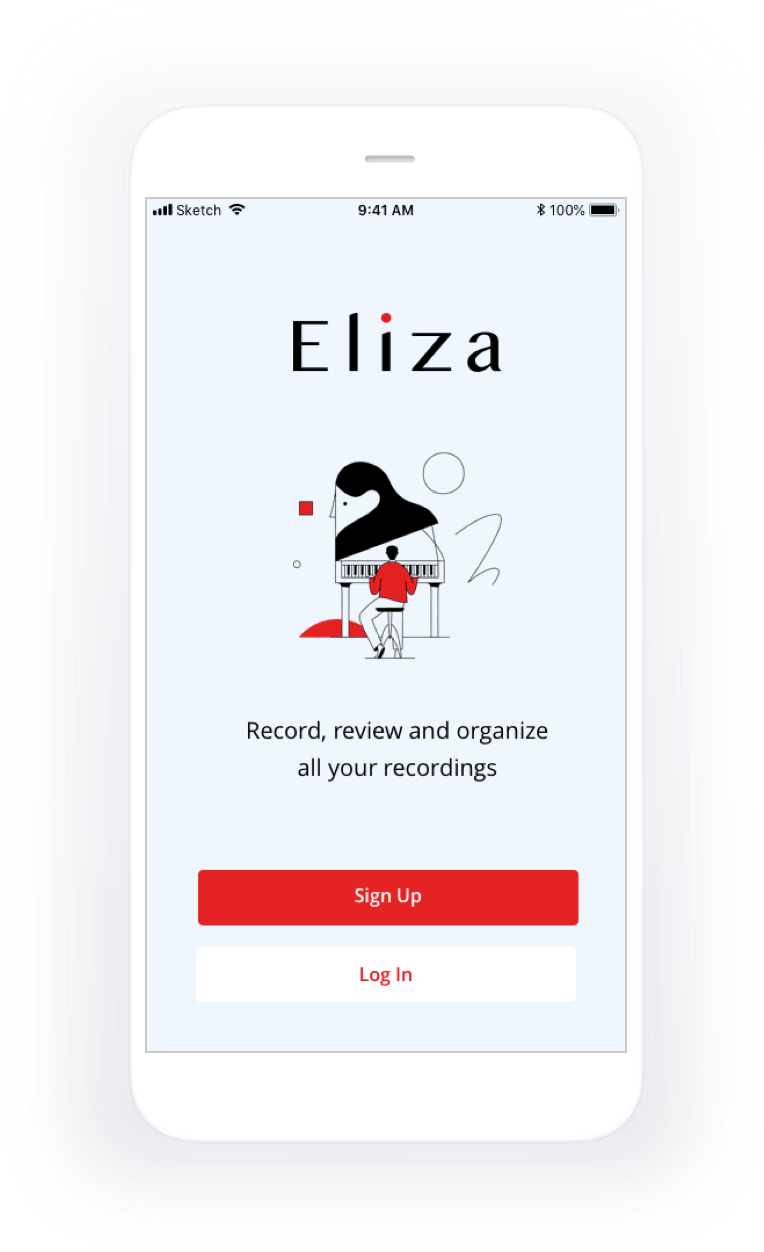
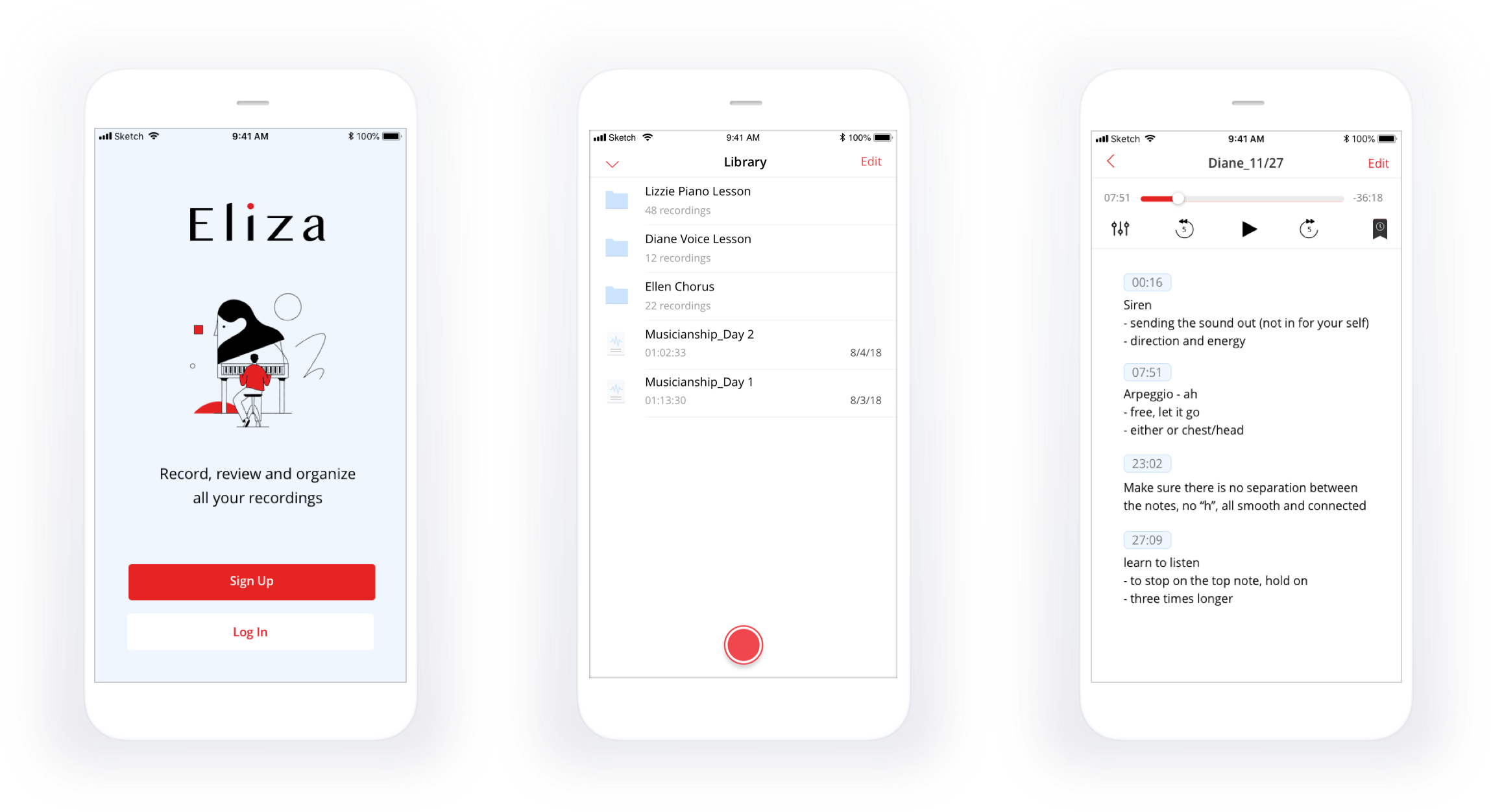
For many music students, lesson recordings are like a time capsule of their music journey that brings them so much joy. They would love to have the recordings well organized so that they can marvel in wonderment at years and years of their memories. That’s why I created Eliza - an app designed for music students to record and keep all of their music lessons in the cloud, then organize and review them with ease.

The screen of Eliza App

2. The Challenge of Traditional Recording Tools

traditional recording tools

Back in the day, before using the cloud storage on mobile, a lot of music students used hand-held recording devices to record the lessons. However, most of them said they never reviewed the recordings because it was difficult to go back and forth to replay the audio on the device.

Later on, students started to record on the phone. Most of them used Voice Memos, Apple’s built-in recording app. The interface has become much more user-friendly and allowed users to review recent recordings in the app. However they often needed to transfer the recordings between the mobile device and the computer when the storage became full.

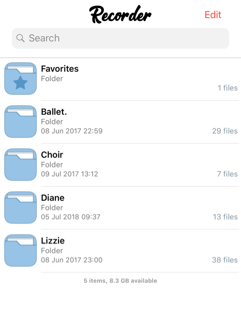
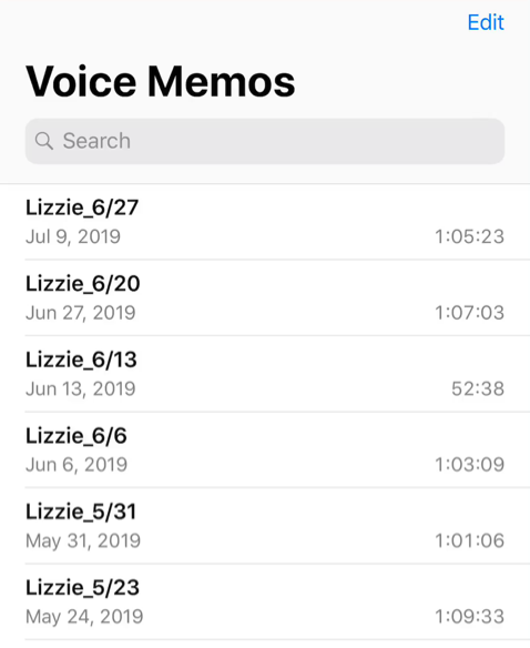
When cloud services became popular, people were excited to store the recordings in the cloud. One popular app that a lot of students used was Voice Recorder but they soon discovered a crucial flaw - when students were recordings the lesson they needed to turn off the Wi-Fi to avoid any interruptions during their music class, yet the app cloud only sync successfully if recordings were made with Wi-Fi turned on. However, one of the benefits they found with the app Voice Recorder was that it included folders to organize recordings, whereas Voice Memo only allowed organizing all recordings by date in a single list.

traditional recording tools
Folders in App Recorder
traditional recording tools
No Folder in App Voice Memos

Some students changed back to using Voice Memo after iOS 12 when the app integrated with iCloud service for users to sync recordings automatically between desktop and mobile. Now they have their recordings safely stored in the cloud but they still seldom review the recordings from months ago. Though they want to, it is very difficult for them to find the item through a long list of recordings with only the filename shown.

Long Recording List in App Voice Memos

3. Solution: Customized Playback Control

After a few casual interviews with music peers, I sent out a survey to identify user’s specific issues with existing recording tools and to discover possible solutions.

According to the survey results, 100% of the students responded that it was difficult to find relevant parts in long recordings. Moving the playback slider back and forth was an obvious annoyance for users. 75% of the participants also stated that playing a few relevant parts repeatedly was difficult. While most users were aware of the fast-forwarding and rewinding buttons in some recording apps, 85% of them remarked that fast-forwarding and rewinding was not always useful because the time intervals were fixed.

Given the survey results, the main problem to solve for our users became clear: how to help users easily find a sound byte in long recordings?

  • Show fast-forward and rewind buttons to let users easily repeat and skip content
  • Give users controls to adjust fast forward and rewind intervals to make them more useful
  • Allow users to bookmark and quickly jump to sections of interest

Show Fast-forward and Rewind

When a user practices along a new recording, they may still have the lesson fresh in memory and could find the relevant part using the slider, but it quickly becomes tedious when trying to repeat a section using the playback slider alone. One user responded:

When a user tries to rewind 10 seconds using the playback slider on a long recording, they may easily rewind too little or too much; not to mention trying to rewind by even smaller intervals.

Frustration of Rewinding 10s with Slider

Although some apps offer interactions that allow users to adjust time by seconds, 45% of participants I interviewed complained that using the slider to replay sections of recordings was very tedious.

Control Fast-forward and Rewind Interval

Currently, most students know how to use the fast-forward and rewind buttons to jump back and forth within recordings, but the interval by which existing apps fast-forward and rewind are fixed and restrictive. 65% of the participants agreed that they could lose focus when the rewind button overshoot, thus needing to listen to irrelevant parts. For example, here’s a few user’s comments:

As a solution, I added controls to allow users to customize the interval by which they may fast-forward and rewind.

Control Fast-forward and Rewind Interval

Although they could only select from a few options, I received positive feedback from users during usability tests. When wanting to repeat a section that was 6s seconds long, they’d much rather tap a 3 second rewind button twice than having to rewind 10s and wait an extra 4 seconds to listen to the part again. Therefore, customizable intervals on fast-forward and rewind buttons can make it easier for users to review and practice small portions of the recordings.

Bookmarks and Notes

When a user reviews a recording, they may want to take note of the specific time and content in the recording in order to keep track of them and review them more easily next time. My solution is to allow the user to create a Time Bookmark to capture the time and write notes alongside the recording.
Capture the Time with Bookmarks

The Time Bookmarks will be clickable timestamps that allow the user to jump directly to the part they will be looking for when reviewing the notes later.

Clickable Time Timestamps

4. Solution: File Organization and Search

With the playback and review features, users can now find sections within long recordings. However, after months and years of usage, it’s still hard to know which song is covered in which recordings. Using filenames can help to an extent, but there are often more than one song in each lesson, which makes it difficult to name the recording file apparently. How would it be possible to find a specific song in the long term?

According to my research survey, 95% of participants said that they needed folders to help organize recordings. 55% found it difficult to search for a recording solely by its file name. 40% said that the recordings take up too much space on their devices.

With existing tools, users often come up with their own ingenious ways to overcome these challenges. However, our app can go a step further to help solve these issues. How can we help users effectively organize and search recordings? I’ve chosen 3 features to address these problems:

  • Create folders to categorize recordings
  • Tag files by topics to facilitate search
  • Upload recordings to cloud storage
organization and search
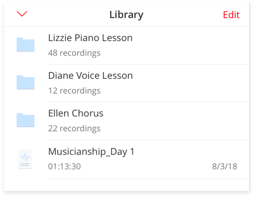
Organize Recordings with Folders
organization and search
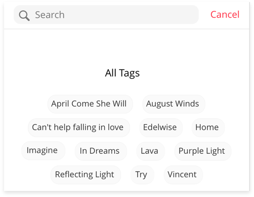
Search Recordings with Tags
organization and search
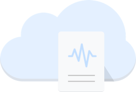
Store Recordings in the Cloud

5. Why Eliza?

The app is named Eliza after the main character from the movie "My Fair Lady". In the story, Eliza was a Cockney flower seller who took speech lessons from a phonetics professor and practiced speech using phonographs. Phonograph is to Eliza as our application is to music students - to record lessons and provide a medium of review to improve one’s voice and instrument skills.

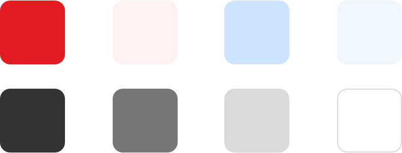
For the main colors, I chose a color palette of red and blue. Red represents the color of a traditional recording button and the color blue was chosen to represent the cloud aspect of a cloud-based service.

Eliza color palette

6. What I learned from Eliza

Eliza was my first UX/UI project. I met with many music students and general users who helped me understand the importance of usability testing; I was able to learn how to better conduct such tests. I was able to iterate the app many times based on user feedback to create interfaces and interactions that were more user friendly.

Another great take-away for me from this project was making use of a design system. After five months of working on the app, when completion was in sight, I realized that I’d forgotten to do the color accessibility test. When I did it, a lot of the color contrast ratios failed. I was worried but at the same time found myself very fortunate to be in a good position to make quick changes, because I’ve spent a lot of time working on creating design components and building a design system. This experience not only taught me to remember to take color accessibility into account in the early stages of the design process, but it also taught me the importance of design system for both the future iterations of this app and all of my future projects.